Layout

Layout, Page layout, Formatting, Design, Screen layout, Grid, Composition
Layout refers to the spatial arrangement of visual elements on a web page or screen. It determines how visitors perceive information and navigate the site.

What is layout?

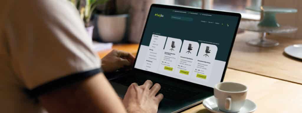
Layout refers to the spatial arrangement of all visual elements on a web page, screen or document. It determines where text, images, buttons and navigation elements are positioned and how they relate to one another. A well-thought-out layout guides your visitor’s gaze, makes information easy to scan and ensures that people find what they’re looking for without having to think about it.

How layout drives the user experience

A layout is based on visual hierarchy, white space and grid structures. Visual hierarchy determines which elements stand out first based on size, colour and position. White space creates a sense of calm and distinguishes between sections. A grid system ensures consistent spacing and proportions. Together, these building blocks form a predictable pattern within which visitors can quickly filter information. In practice, this means that a visitor must understand within three seconds where they are and where they need to click. On SME websites, we often see too many elements placed without any hierarchy, causing visitors to leave the page without taking any action.

From print to responsive screens

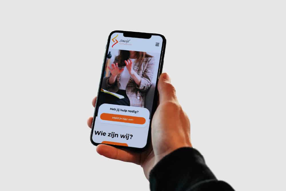
Layout originally stems from graphic design and the printing industry, where designers worked with fixed formats and static pages. With the rise of websites in the 1990s, the focus shifted to flexible grids that adapt to different screen sizes. Since the smartphone revolution, responsive layout has become the standard. This means that the same content is arranged differently on desktops, tablets and mobiles. The W3C Grid Layout model provides a standardised technical basis for this. This is crucial for Dutch companies because more than 60 per cent of web traffic comes via mobile devices.

This provides a strong framework for small and medium-sized companies

A clear layout increases conversion rates because visitors reach the action you want them to take more quickly. Think of a contact form that is prominently displayed or a product overview where the key USPs can be scanned at a glance. In a professional web design process, layout is always linked to your company objectives and the customer journey. In practice, we find that SMEs often have an existing layout that has evolved without a strategy. By redesigning the layout based on user experience principles and measurable goals, you’ll see an immediate impact on time on page, bounce rate and conversion. Furthermore, a consistent layout fosters recognition and trust – two factors that carry significant weight in B2B services.

Applications of layout

Layout plays a role in virtually every digital touchpoint, from your homepage to your quotation form. Each page serves a different function and therefore requires a tailored arrangement of elements. Below are four specific situations in which layout makes the difference between a visitor taking action and a visitor abandoning the site.

Homepage layout for quick orientation

The homepage is often the first point of contact. Here, a visitor must understand within five seconds what you do, for whom, and what action they can take. An effective homepage layout places the core message above the fold, uses a clear visual hierarchy and displays a maximum of three calls to action. With small and medium-sized companies, we often see too much information crammed in at once: services, news items, client logos and contact details all jumbled together. A streamlined layout focuses attention on a single primary action, such as requesting a free scan or viewing a case study. The rest of the information follows in logical sections further down the page. This boosts conversion rates because visitors do not have to choose from ten options at once.

Product page layout for e-commerce

On a product page, the layout must support the purchasing decision. This means product photos prominently positioned on the left or in the centre, with product information on the right showing the price, stock status and order button immediately visible. Below this come specifications, reviews and related products. An online shop with 500 products benefits from a consistent layout that allows visitors to compare and order quickly. Variations in layout across product categories can be confusing. In practice, we often test the position of the call-to-action, the size of product images and the order in which information is presented. A well-designed online shop uses a layout optimised for conversion, not just aesthetics. Simply placing the ‘Add to basket’ button higher up the page can increase conversion rates by up to 20 per cent.

Blog page layout for readability

A blog page or knowledge base page requires a layout that keeps long text readable. This means a narrow text column no more than 75 characters wide, sufficient white space around paragraphs, and clear subheadings that break up the text. Images and lists provide visual breaks in the text. A sidebar with related articles or a table of contents helps visitors navigate. For small and medium-sized companies using content marketing, a readable layout is crucial for dwell time and organic reach. Google favours pages where visitors stay longer. A layout that encourages reading contributes directly to this. Do ensure that the layout also works well on mobile devices, as that is where most blog articles are read.

When is layout the right choice, and when is it not?

A new layout makes sense if your conversion rates are lagging behind, visitors are leaving the site quickly, or your brand identity isn’t recognisable. It isn’t a solution if your content itself is unclear or irrelevant. A beautiful layout cannot mask a weak message. In practice, we see that companies sometimes want a redesign when the problem actually lies in the tone of voice, the offering or the positioning. You should therefore always start by analysing your target audience and your business objectives before tackling the layout. Layout optimisation works best in combination with conversion design and A/B testing. This allows you to measure whether the new layout actually performs better than the old one.

Want to apply this in your company? Monkey Vision helps SME entrepreneurs with web design, SEO and smart digital solutions. Plan a no-obligation discovery call and discover what is possible for you.

Plan a discovery call

Frequently asked questions

No, layout is part of design but not the same thing. Design encompasses all visual and functional choices such as colour, typography, interaction and brand identity. Layout focuses specifically on the spatial arrangement of elements on a page. You can have a strong layout with weak colours, or vice versa. In practice, however, layout and design do work closely together. A professional brand identity provides direction for the layout by defining fixed proportions, white space and grid systems. This ensures the layout remains consistent across all pages and channels. Think of layout as the skeleton and design as the skin and clothing around it.

A grid layout uses fixed columns and rows, offering predictability and consistency. This works well for websites with a lot of structured content, such as online shops, portfolio sites or news platforms. A flexible layout adapts dynamically to screen size without a fixed grid and is ideal for one-pagers or creative websites. In practice, most modern websites combine both systems using CSS Grid and Flexbox. For small and medium-sized companies with various page types, we recommend a hybrid approach. The main structure follows a grid for consistency, whilst within sections you use flexible elements to ensure responsiveness. Have a front-end developer implement this technically based on your content strategy.

Start with a heatmap analysis to see where visitors click, scroll and drop off. Tools such as Hotjar or Microsoft Clarity visually show which parts of your page are getting attention and which are being ignored. Compare this with your business objectives. Is your main call-to-action in a hot zone, or is it being missed? Next, create a wireframe in which you reorder the elements based on priority and user behaviour. Test the new layout on a landing page first before updating the entire site. Measure conversion rates, time on page and bounce rates. For larger websites, it’s worth working with a web design agency that combines layout, UX and conversion optimisation. This prevents you from making purely visual improvements without any measurable results.

The best approach depends on your current situation and goals. Do you already have a website but are conversion rates lagging behind? Or are you building a new site and want a strong foundation right from the start? Book a free 30-minute UX scan at Monkey Vision. We’ll walk you through your current or planned layout live and immediately provide three concrete areas for improvement that you can tackle this month. You’ll receive an honest assessment of your growth potential and which layout adjustments will have the greatest impact for your sector. No sales pitch – just practical advice based on our experience with SMEs in the region. Take a look at our web design approach or get in touch straight away to book a scan.

About the author

Monkey Vision

Monkey Vision is a full-service digital agency based in London, specialising in web design agency, SEO and AI automation for SMEs. The knowledge base is compiled by our team of online strategists and continuously updated based on current insights.

Publication date: 26-04-2026
Last update: 26-04-2026