Colour use

Colour choice, colour application, colour scheme, colour palette, colour usage, colour scheme
Colour usage is the strategic application of colours in visual communication to drive recognition, emotion and action. It determines the impact of your website, brand identity and marketing.

What is the use of colour?

Colour usage refers to the deliberate choice and application of colours in visual communication, such as websites, brand identities, marketing and interfaces. It encompasses both the selection of primary and secondary colours and their combination, contrast and proportion. Effective use of colour strengthens brand recognition, influences emotion and behaviour, and enhances the user experience. For small and medium-sized companies, it determines whether visitors gain trust, notice a call-to-action, or, conversely, are put off by visual clutter.

How colour works in visual communication

The use of colour operates on three levels: psychological, functional and cultural. Psychologically, every colour evokes associations, such as blue for reliability or red for urgency. Functionally, colours provide hierarchy and readability, for example through contrast between text and background or through accent colours on buttons. Culturally, meanings vary by region; in the United Kingdom, for example, this is evident in the preference for neutral tones in B2B communication. An effective colour scheme combines these three layers and translates brand values into visual codes that the target audience recognises and understands. In practice, we often see companies starting with a primary colour from their logo and building a complementary palette around it.

Why the use of colour emerged and why it matters now

The use of colour as a design principle originated in the worlds of graphic design and advertising, where colour was employed from an early stage to attract attention and reinforce messages. With the rise of digital media and accessibility guidelines such as the W3C’s WCAG standards, the use of colour also became a matter of user-friendliness and inclusion. Nowadays, colour matters not only for aesthetics, but also for conversion, accessibility and consistency across channels. An online shop that uses colour strategically sees higher click-through rates on calls-to-action and less confusion in navigation.

What the use of colour delivers for small and medium-sized companies

For small and medium-sized companies, a well-considered use of colour delivers immediately measurable benefits: higher brand recognition, better conversion rates and stronger positioning. A consistent colour palette reinforces your visual identity and makes you recognisable in email campaigns, on social media and on your website. Good contrast and accessible colour choices lower the barrier for visitors with visual impairments or colour blindness, which broadens your reach. At Monkey Vision , we integrate colour into every corporate identity and web design project, ensuring that colour is not only aesthetically pleasing but also works towards your business objectives. Furthermore, a clear colour scheme helps your team to communicate consistently, from quotes to newsletters.

Applications of colour usage

In practice, the use of colour recurs in many areas: from your logo and website to your presentations and packaging. Each application requires a different balance between recognisability, functionality and emotion. Below are four specific situations in which the use of colour makes a difference for small and medium-sized companies.

Use of colour in web design and user interfaces

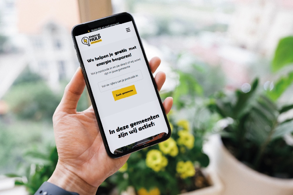
On a website, colour draws attention and determines the hierarchy. Accent colours on buttons such as β€˜Order now’ or β€˜Contact us’ increase the click-through rate, provided they contrast sufficiently with the background. Neutral colours for text and backgrounds ensure a sense of calm and readability, whilst the brand colour in the header and footer enhances brand recognition. In practice, we often see with SME clients that an overly busy colour palette leads to confusion: visitors do not know where to click. A clear user interface design uses a maximum of three to four main colours and applies them consistently. Accessibility is essential here: a contrast ratio of at least 4.5:1 between text and background complies with WCAG guidelines and makes your site usable for everyone.

Use of colour in branding and brand identity

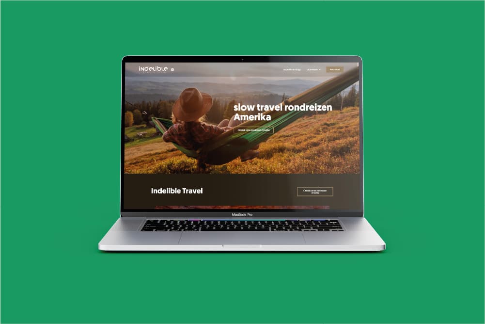
In your brand identity, colour forms the basis of brand recognition. A consistent colour palette across business cards, your website, email signatures and social media ensures that customers recognise you within a second. Many SMEs choose a single primary brand colour that expresses their core value, such as green for sustainability or dark blue for professionalism. Around this, you build a palette of secondary and neutral colours to allow for flexibility. At Monkey Vision , we always document colour codes in a brand guideline, so that suppliers and partners use exactly the same shades. A common mistake is choosing too many colours, which makes your brand look cluttered and unprofessional. Limit yourself to a maximum of five colours in your entire palette.

The use of colour in e-commerce and conversion optimisation

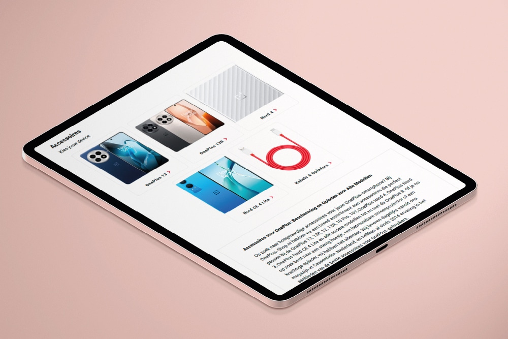
In online shops, colour has a direct influence on purchasing behaviour. Red or orange on an β€˜Add to basket’ button creates a sense of urgency, whilst green conveys trust and security on payment buttons. Colour-coding product variants, such as size or colour, also lowers the barrier to making a choice. An online shop with 500 products that uses colour strategically in filters, labels and calls to action sees, on average, a higher conversion rate than a shop with only black-and-white buttons. Please note: colour should never be the sole indicator, as colour-blind visitors will miss that information. Always combine colour with text, icons or patterns. In online shop projects, we often test colour choices using A/B testing to see which combination yields the highest conversion rate.

When colour use is the right choice and when it is not

The use of colour is always relevant, but the complexity varies. For a local service provider with a simple website, a basic palette of two colours plus black and white is sufficient. For a brand with multiple product lines or target audiences, a more extensive colour system may be required, with distinct accents for each line. Colour is less suitable as the sole distinguishing factor: if you rely solely on colour without strong positioning or a visual identity, you will remain interchangeable. Nor is colour the solution to unclear messages or poor information architecture. A cluttered website won’t be improved by a beautiful colour palette. Therefore, always start with strategy and structure, and let colour reinforce those choices.

Want to apply this in your company? Monkey Vision helps SME entrepreneurs with web design, SEO and smart digital solutions. Plan a no-obligation discovery call and discover what is possible for you.

Plan a discovery call

Frequently asked questions

No, the use of colour is broader than a colour palette. A colour palette is the set of colours you select, for example three primary and two secondary shades. Colour usage also encompasses how you apply those colours: which colour do you use for headings, buttons, backgrounds and accents? It’s about the proportions, the contrast and the context. A good palette without clear rules for application will still lead to inconsistency. In practice, you often see that companies do have a nice palette, but they do not use it consistently across different channels. Colour usage is therefore the strategy and its implementation; the palette is merely the tool.

Start with strategy and test using data. Colour must align with your brand values and target audience, so feeling and intuition play a part. But don’t rely solely on personal taste: test your colour choices for contrast, accessibility and conversion. Tools such as contrast checkers show whether your colour combinations comply with WCAG guidelines. A/B testing on your website reveals which colour for a call-to-action yields the highest click-through rate. For small and medium-sized companies, a hybrid approach works best: start with a strategic colour choice based on positioning, validate it against accessibility criteria and optimise it using data. This way, you combine brand identity with measurable results.

The most common mistake is insufficient contrast between text and background, making the site difficult to read. In addition, we often see too many colours used at once, leading to visual clutter and confusion. A third mistake is inconsistency: the same button has a blue background on one page and a green one on another. Colour is also sometimes used as the sole indicator, for example red for error messages without accompanying text, which causes problems for colour-blind visitors. Finally, companies sometimes choose colours that do not suit their target audience, such as bright neon colours for a consultancy firm seeking to project an image of reliability. Avoid these pitfalls by documenting colour usage in a brand guideline and testing for accessibility.

Would you like to know which colour palette and colour scheme suit your brand and target audience? Book a free 30-minute brand strategy scan with Monkey Vision. We’ll analyse your current visual identity, discuss your positioning and immediately provide three concrete recommendations for colour usage on your website, brand identity and marketing materials. You’ll receive an honest assessment of what works and what doesn’t, with no sales pitch. It’s the ideal starting point for a consistent and recognisable brand image. Book your session via β€˜brand identity and branding’ at Monkey Vision and take the first step towards a stronger brand.

About the author

Monkey Vision

Monkey Vision is a full-service digital agency based in London, specialising in web design agency, SEO and AI automation for SMEs. The knowledge base is compiled by our team of online strategists and continuously updated based on current insights.

Publication date: 26-04-2026
Last updated: 28 June 2026