Visual Language

Visual language, Visual language, Visual identity language, Visual language system, Graphic language
Visual Language is the set of visual elements such as colour, typography, shape and photography that make up your brand identity. It ensures recognition and consistency.

What is Visual Language?

Visual Language is the cohesive system of visual elements through which your brand communicates. It includes colour use, typography, shape language, photo style, iconography and compositional principles. These elements work together as a visual grammar that conveys your brand message without words. For an SME company, this means that visitors recognise your website, leaflet or social media within a second and make the right association with your service or product.

How does an effective Visual Language work in practice

A well-thought-out visual language consists of fixed design rules that you apply to all communications. Think of a fixed colour ratio of primary, secondary and accent colours, a typographic hierarchy with a maximum of three typefaces, and a predictable way of framing images or constructing compositions. For example, a building materials wholesaler often opts for clean, straight lines and industrial photography, whilst a nursery uses soft curves and warm colours. These choices are no coincidence but stem from your brand positioning and the emotion you wish to evoke. At Monkey Vision , we’ve noticed that companies without a clear visual language often come across as haphazard, making it difficult for potential customers to remember what you do or to build trust.

Why Visual Language came into being and why it matters now

The concept comes from graphic design and became popular in the 1990s when companies were putting brand perception at the centre. Where a logo and house colour used to suffice, customers now expect a consistent visual experience across website, app, packaging, social media and shop interiors. In practice, this means that your Visual Language has become a strategic tool. According to the W3C Web Accessibility Initiative, clear visual language also contributes to accessibility, as colour contrast, legibility and predictable layouts help people with visual impairments understand content.

What Visual Language brings to SME companies

A consistent Visual Language lowers the barrier to engage with your company. Visitors recognise you faster, remember you longer and link your visual style to an expectation about quality or atmosphere. An online shop with a clear visual language often sees higher conversion, because customers feel more confident about what to expect. In a corporate identity project at Monkey Vision, we therefore first build a visual language before we start working on individual expressions. This saves time and money later, because you don't have to rethink which colours or typography to use for each new leaflet or landing page. Internally, it also helps your team and external suppliers to stay on-brand without endless briefings.

Applications of Visual Language

Visual Language is not a theoretical framework but a practical tool that you deploy in all places where your brand is visible. Below you can read where SMEs benefit most from clear visual language and how to apply it concretely.

Website and digital channels for recognition and conversion

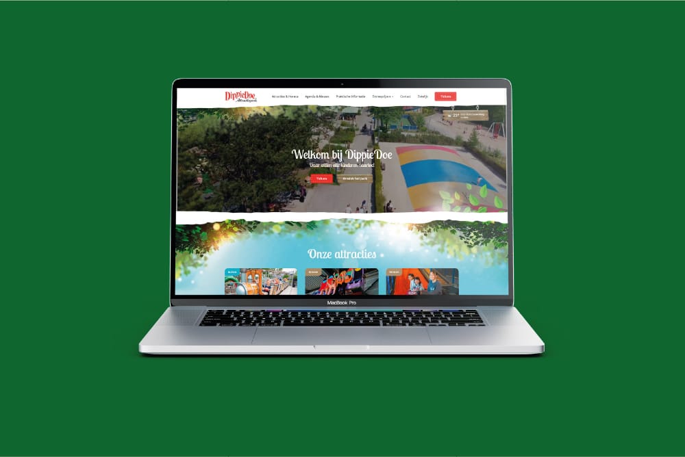
On your website, Visual Language determines how visitors experience you and whether they stick around. Consider a fixed colour ratio for buttons, a typographic hierarchy that separates headlines from body text, and a photo style that suits your target audience. An accounting firm often chooses calm blues and greys with business portrait photos, while a fitness studio uses bright accent colours and action images. Laying down these choices in a design system keeps your site consistent, even if you add new pages or another team member posts content. In a well-thought-out web design process, we translate your brand strategy into concrete visual rules that increase your conversion and reduce bounce rates.

Packaging and physical expressions for brand experience in the shop

If you sell products through retail or your own shop, your Visual Language is the first impression customers physically experience. Packaging design, labels, displays and shop design follow the same colours, shapes and typography as your website. For example, an artisan bakery might have chosen a handwritten font, kraft paper and a warm ochre colour. You repeat those choices on bread bags, menus and the mural in the shop. This makes customers immediately recognise your brand and creates a cohesive experience. In practice, we see that companies with a strong visual language build higher brand value, making them less dependent on price promotions.

Social media and ads for quick recognition

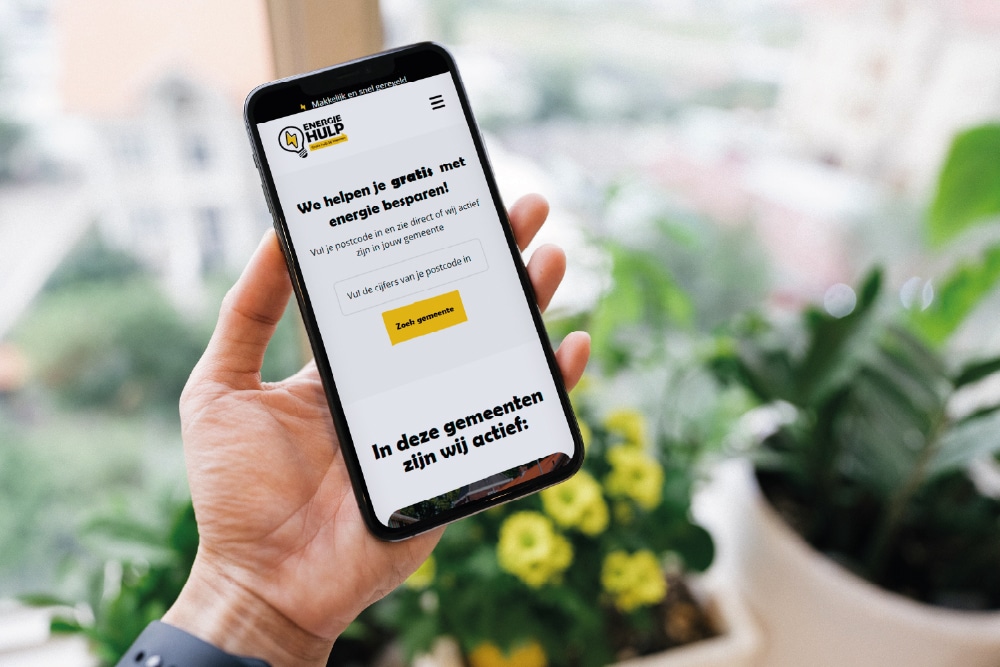
On social media, your target audience scrolls by at lightning speed. A recognisable Visual Language ensures that your posts stand out and are directly linked to your company, even without a logo. You achieve this with fixed templates for Instagram Stories, a consistent filter style for photos and a colour accent that always returns. For example, an interior designer always uses the same minimal composition with lots of white space and one accent colour, while a restaurant business shares vibrant, warm images with a fixed vintage filter. Through this repetition, you build brand recognition without having to rethink every post. In SEO projects, we find that visually consistent content also performs better in Google Discover and image search.

When Visual Language is the right choice and when it is not

Visual Language is valuable as soon as you have more than one form of expression and want to grow your brand. Think of an online shop that also sells offline, a service provider that has both a website and brochures, or a scale-up that has multiple team members creating content. By contrast, if you have a one-man business with just a business card and a simple one-pager, then an extensive visual system is unnecessary. In that case, invest in a clear brand identity first and build out your Visual Language as you grow. A common mistake is to establish visual rules but then not enforce them, which means you still come across as inconsistent.

Want to apply this in your company? Monkey Vision helps SME entrepreneurs with web design, SEO and smart digital solutions. Plan a no-obligation discovery call and discover what is possible for you.

Plan a discovery call

Frequently asked questions

No, although they are closely related. A brand identity includes logo, colours and typography as fixed principles. Visual Language goes a step further and describes how to apply those elements in compositions, photo style, iconography and movement. Think of a brand identity as your toolbox and Visual Language as the way you use those tools to establish a recognisable style. At Monkey Vision , we first build a brand identity and then translate it into a Visual Language you can apply to all channels. This way, you prevent your brand from looking different on Instagram than on your website or packaging.

It depends on your experience and the complexity of your brand. If you have a simple company with one target group and limited expressions, then with a good template and some sense of colour and typography, you can start by yourself. However, if you want to address multiple target groups, create offline and online cohesion or establish a brand that stands out in a crowded market, it pays to hire an agency. A professionally developed Visual Language will save you time later and prevent visual noise. At Monkey Vision , we start with your brand strategy and translate it into concrete visual rules your team can apply immediately, including templates and guidelines.

Start by mapping your current visual expressions. Collect screenshots of your website, pictures of packaging, social media posts and print materials. Lay these side by side and see if you see a common thread in colour, shape and atmosphere. If that consistency is missing, it is time to draw up a brand core with your core values and target audience. Then translate that into visual choices: which colours match those values, which typography appeals to your target group, which photo style matches your positioning. Record these choices in a simple document with examples and use it as a guideline for all new communications. This way, you build up a recognisable visual language step by step.

The best first step depends on where you are now. Do you already have a logo and brand identity but notice that your expressions go in all directions visually? Then it's time to translate that foundation into a cohesive Visual Language. Schedule a free 45-minute brand analysis at Monkey Vision, in which we go through your current expressions live. You'll immediately get three concrete areas for improvement that you can pick up this month, plus an honest estimate of what a complete visual language will deliver for your industry. No sales pitch, just practical advice from our experience with hundreds of SME branding projects.

About the author

Monkey Vision

Monkey Vision is a full-service digital agency based in London, specialising in web design agency, SEO and AI automation for SMEs. The knowledge base is compiled by our team of online strategists and continuously updated based on current insights.

Publication date: 26-04-2026
Last update: 27-04-2026